
Internal specification
Brand Book
Monavel Brand Guidelines v1
Internal design specification for Monavel identity, product language, and system tokens.
1. Brand Philosophy
Mission
Transform every hotel into an autonomous AI-powered operation.
Vision
Monavel becomes the operating system connecting guests, staff, data and automation into one intelligent workspace.
Positioning
AI Operating System for Hotels.
Monavel is not
- chatbot
- PMS
- CRM
Monavel is the Operating System sitting above all hotel systems. It connects reservations, guest communication, operations, knowledge, revenue, and automation into one Runtime — without replacing the systems of record hotels already trust.
2. Brand Personality
Monavel is
- Calm
- Intelligent
- Premium
- Operational
- Reliable
- Invisible technology
Never
- Playful
- Flashy
- Crypto
- Startup hype
- Enterprise corporate
- Futuristic for the sake of being futuristic
3. Brand Principles
Intelligence
Understanding comes before action. Context from reservations, rooms, channels, and policy becomes one operational picture.
Automation
Routine work executes quietly across connected systems. Staff intervene when judgment matters — not to move data by hand.
Hospitality
Every interaction respects the guest and the property. Speed never replaces care; clarity never replaces warmth.
Trust
Human oversight, audit trails, and reliable sync make the platform safe to run a real hotel.
4. Logo
Official SVG sources: /brand/monavel-mark.svg, /brand/monavel-horizontal.svg, /brand/monavel-lockup.svg, and /brand/monavel-wordmark.svg.
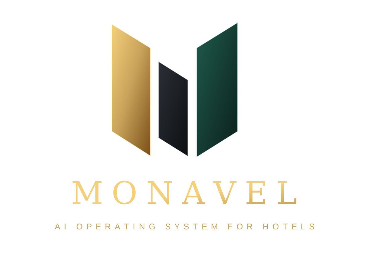
/brand/monavel-lockup.svg/brand/monavel-horizontal.svg
/brand/monavel-mark.svg
/brand/monavel-wordmark.svg/brand/monavel-mark.svgUsage rules
- Use official SVG sources from /brand only.
- Keep clear space equal to the height of the monogram on all sides.
- Minimum digital size: mark 16px; horizontal lockup 88px wide.
- Use the stacked lockup for large identity — never scale it into navigation chrome.
- Prefer brand gold or monochrome on brand surfaces.
Incorrect usage
- Stretching or compressing
- Recoloring outside approved brand colors
- Drop shadows or glows
- Outlines or strokes
- Rotating
- Changing proportions
5. Color System
#0B0D10--brand-blackPrimary brand surface. Documentation and identity backgrounds.#121418--brand-charcoalRaised brand surfaces, panels, and quiet containers.#0B1F1B--brand-greenIdentity graphics, illustration fields, subtle brand gradients.#C8A25A--brand-goldLogo, premium identity, print, and presentation materials.#F2F2F2--brand-whitePrimary text and high-contrast marks on dark brand surfaces.#686F76--brand-graySecondary text, captions, and quiet labels in brand materials.6. Color Usage
Brand Gold
Only
- Logo
- Identity
- Presentations
- Premium materials
Never
- Buttons
- Success
- Links
- Charts
Product Green
Existing product UI accent (`--mkt-accent` / `--shell-accent`). Not brand gold.
Only
- Buttons
- AI
- Status
- KPIs
- Revenue
- Success
Never
- Logo fill as default identity
- Print stationery
Brand Green
Only
- Backgrounds
- Identity graphics
- Illustrations
- Gradients
Never
- Primary interactive controls
- Success indicators
7. Typography
Display → H1 → H2 → H3 → Body → Small → Metric / Caption. Never skip levels for decoration.
Everything your hotel needs.
One Runtime. Every perspective.
Built to run a real hotel
Guest context stays synced
Run reservations, guest communication, hotel operations, and AI reception from one connected workspace.
Works with your existing PMS.
$9.2k
Room 407 · Live
Reading width. Prose measure stays near 58ch (`--mkt-prose-max`). Body max 64ch. Headlines may be shorter.
Text rhythm. Stack with `--mkt-stack-*`. Section headers use `--mkt-section-header-gap`. Prefer quiet vertical rhythm over large empty fields.
8. Spacing
--mkt-space-18px · 0.5rem--mkt-space-212px · 0.75rem--mkt-space-316px · 1rem--mkt-space-424px · 1.5rem--mkt-space-532px · 2rem--mkt-space-648px · 3rem--mkt-space-764px · 4rem--mkt-space-896px · 6rem- Section spacing. Section vertical rhythm uses `--mkt-section-y-tight`, `--mkt-section-y`, `--mkt-section-y-loose`.
- Card padding. Card padding defaults to `--mkt-card-padding` (`--mkt-space-4`).
- Stack spacing. In-component stacks: `--mkt-stack-xs` through `--mkt-stack-xl`.
- Gap system. Grid and flex gaps: `--mkt-gap` and `--mkt-gap-lg`.
9. Components
Cards
Quiet containers for interaction or grouped content. Prefer border emphasis over heavy shadow. Hover lift is 2px when interactive.
Buttons
Primary uses product accent. Secondary and ghost stay quiet. CTAs use canonical labels from product language.
Badges
Short status or category labels. Overline size. Never decorative pill clusters.
Status
Canonical verbs only: Connected, Online, Synced, Booked, Approved, Delivered, Confirmed, Scheduled. Calm opacity — no blinking.
KPIs
Short names (Revenue, Response Time, Guests). Metric type for values. Count once on enter.
Accordions
One duration, one easing, height/opacity transitions. FAQ and comparison share the same language.
Lists
Operational bullets with restrained markers. Prefer clarity over ornament.
Chat bubbles
Guest left, AI right. Short operational replies. Never marketing enthusiasm.
Quiet container. Border before shadow.
10. Motion
150–250ms for UI transitions (Fast / Normal / Slow).
Shared ease: cubic-bezier(0.22, 0.61, 0.36, 1)
- Fast: 180ms
- Normal: 260ms
- Slow: 360ms
Allowed
- Opacity
- Small translate (≈6px reveals, 2px card hover)
- Shared ease-out
Forbidden
- Bounce
- Scale explosions
- Decorative animation
- Elastic overshoot
Reduced motion. Respect prefers-reduced-motion. Replace movement with opacity. Keep controls usable.
11. Photography
Preferred
- Luxury hotels
- Architecture
- Natural materials
- Warm lighting
- Minimal interiors
Avoid
- Stock business teams
- Corporate handshakes
- People pointing at laptops
- Random AI imagery
12. Illustration
Should feel
- Operational
- Minimal
- Technical
- Dark
- Elegant
Never
- Cartoon
- SaaS-isometric
13. Iconography
- Thin stroke
- Rounded corners
- Consistent weight
- No filled icons as the default system style
14. Voice & Tone
Keep language operational. Short. Confident. Never hype.
Good
- Reservation confirmed.
- Guest notified.
- Transfer booked.
Bad
- Great!
- Amazing!
- Our revolutionary AI...
15. Product Language
Never invent synonyms for the same meaning.
Status
KPIs
CTAs
16. Brand Applications
- Website
- Dashboard
- Admin
- Presentation
- Business card
- Social media
- PWA
- App icon
- Documentation
17. Design Principles
Does this feel like an operating system?
Not: Does this simply look beautiful?
Beauty is a consequence of clarity.
18. Release Checklist
Every future feature should pass this checklist before shipping.
- Correct logo
- Correct colors
- Correct spacing
- Correct typography
- Correct terminology
- Correct motion
- Correct tone
- Correct hierarchy
- Premium appearance
- Operational feeling